When Disappearing Graphics Are Brought into View

I have been blessed with opportunities to produce the graphic designs for a variety of exhibition projects over the years. There is no such thing as routine when it comes to the task of developing designs appropriate for an exhibition while dealing with their unique constraints and working under a limited budget and tight schedule, so I feel that I have always simply had to wrack my brains and patiently try to come up with ideas suitable for each show. For the Windowology exhibition, the production team led by exhibition director Taro Igarashi pitched in ideas while I did my best to fulfill my professional duty as a graphic designer by creating visuals that would be unique to this exhibition.
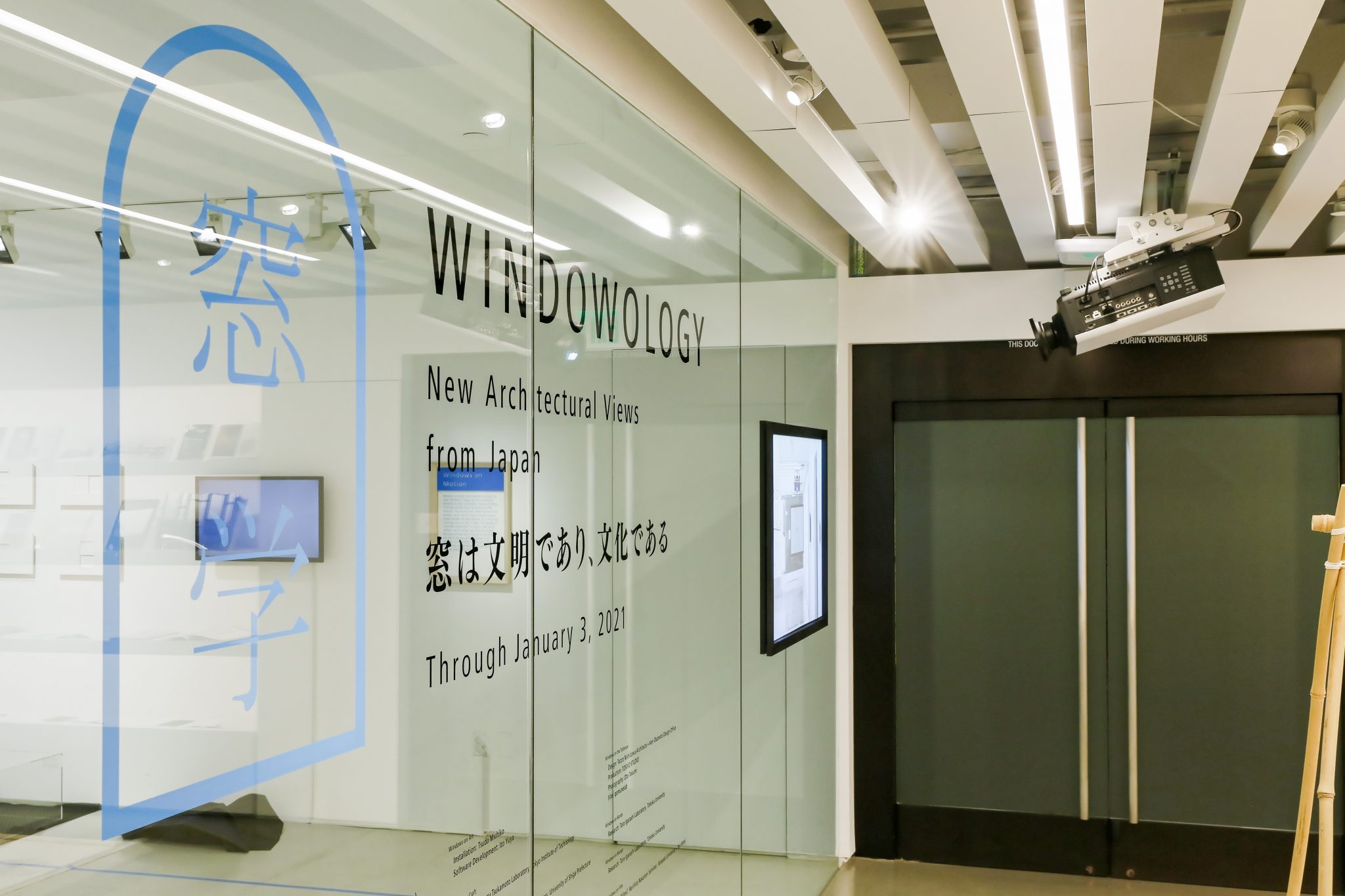
Graphics for exhibitions can be broadly grouped into “publicity graphics”, which include posters and flyers that serve to announce the exhibition, and “venue graphics”, which include captions and signs that serve to support the viewing experience. While the former require visuals that exert a strong pull so that people become interested in visiting the exhibition, I have always believed that the latter should play the role of inconspicuous stagehands that help viewers unconsciously become immersed in the viewing experience.
I think that in order to achieve such an immersive viewing experience, it is important to present visitors with the captions and other various information as stresslessly as possible. The readability of texts arranged on exhibition surfaces is affected not only by the size of the lettering but also the subtle differences in the spacing of the lines and letters, so I believe the primary goal in designing venue graphics should be to meticulously work these things out to ensure that visitors can take in the texts without thought, in a good sense. It is while doing this that I will also try to shape the identity of the exhibition by incorporating little quirks in the graphics that create a certain ambience unique to the show.
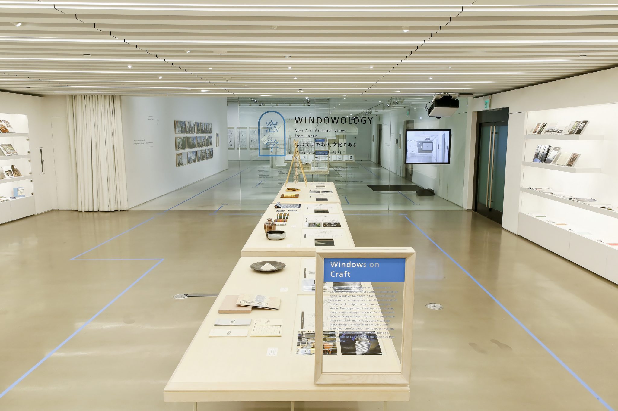
Now, venue graphics also include warning signs, which should not go unnoticed. “No photography” and “do not touch” are the most typical examples, but for this exhibition held during the pandemic, unfamiliar warnings such as “please wear a mask”, “please check your temperature”, and “please sanitize your hands” suddenly appeared, and new rules were set to control people’s behavior. For the shows in Los Angeles and São Paulo, I ended up having to restrict even where people could walk by marking out one-way viewing routes on the floor to prevent crowding within the venues.

So, I found myself in a situation where the venue graphics that I had worked so hard on to create an immersive viewing experience became more about controlling visitors to keep the exhibition safe, and this undermined the essence of not only the venue graphics but of the viewing experience itself.
Incidentally, it was during the Tokyo Olympics of 1964 that pictograms first came into use as a means for facilitating communications with visitors from overseas, and in 2021, a slew of new cautionary pictograms were born to prevent virus infections. One could say that the pictograms are good examples of graphic designs fulfilling their role in that they are able to function just as well in the exhibitions in Los Angeles or São Paulo. However, I am hoping that there will come a day when people will again be able to immerse themselves in the viewing experience by moving about without restriction and using their senses freely, and I wish to once again design “disappearing” venue graphics that serve to draw visitors into the unconscious.
Exhibition Graphics: Ken Okamoto